MARCiE Tachikawa
Interior design by Log.design Co.,Ltd.
Client / MELLOW JAPAN LIMITED Co.,Ltd.
Construction / Yukendo Inc.
Lighting / ModuleX Inc.
Photo / Kento Kubota (STUDIO FENCE)
December 2022
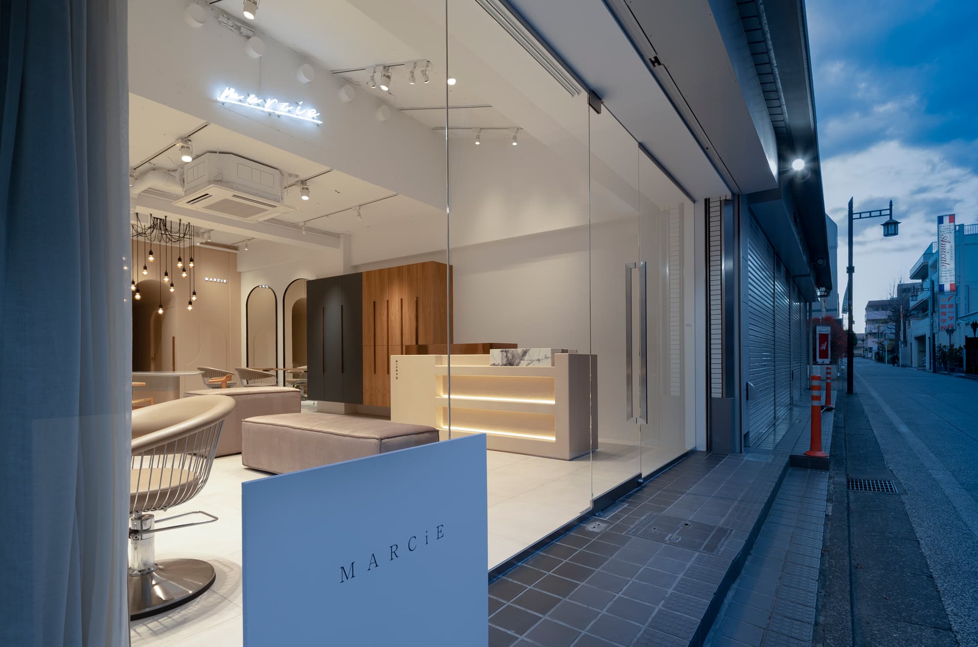
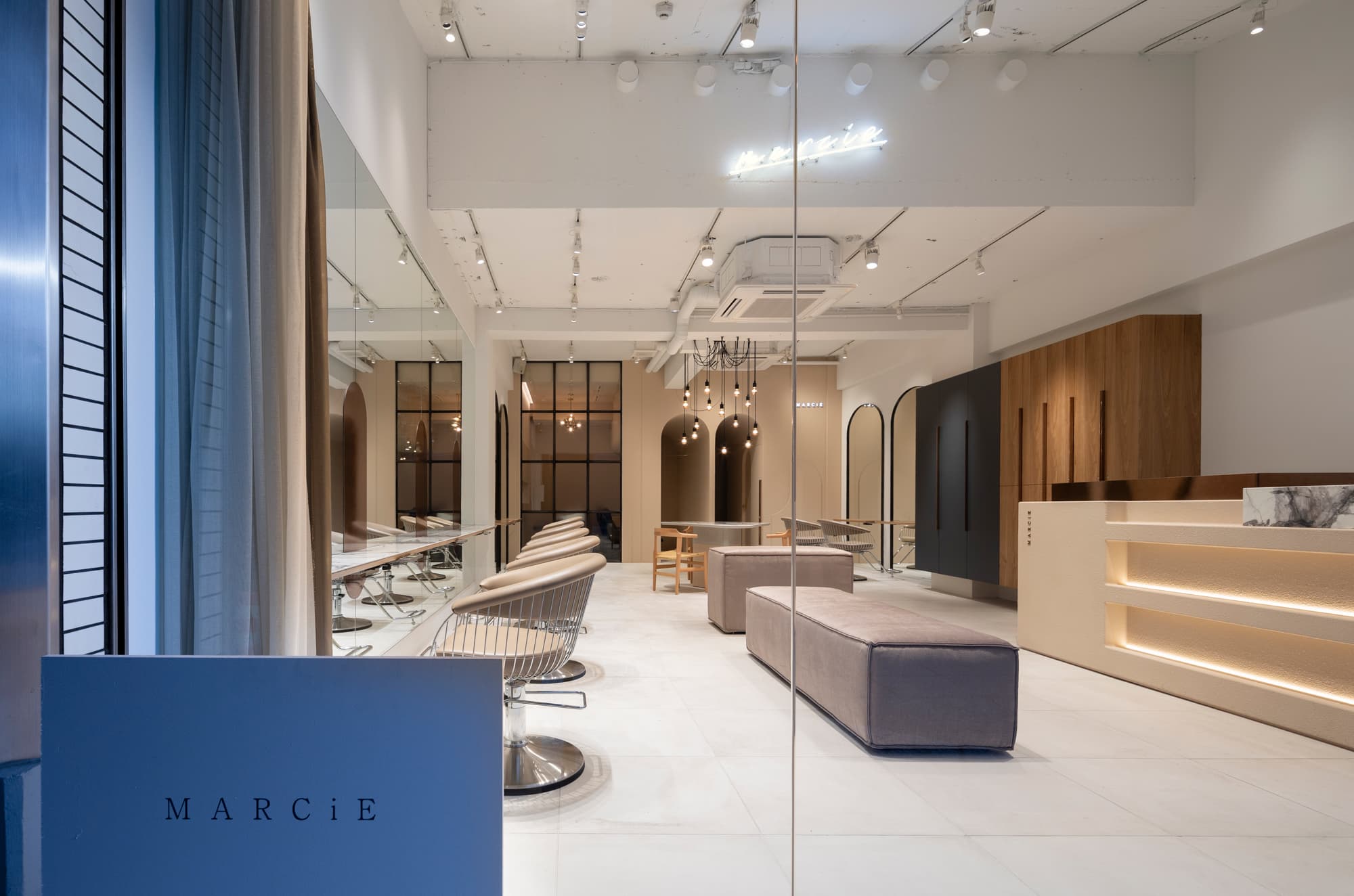
When planning the interior design for MARCiE, a beauty salon in Tachikawa City, Tokyo, we considered that the most important pointour primary focus is to pay close attention to detailwas on meticulous attention to detail and to create a space that is notdefies the typical "beauty salon-like." look.
Tachikawa is one of the most most popular cities for livingvibrant cities in Tokyo, with numerous and there are many universities and colleges there. Therefore As such, it is a highly competitive area this area is a highly competitive area for beauty salons. To show the special uniqueness of this salon in such a situationstand out from other salons, we proposed the space to be filledenvisioned a space filled with athe one-of-a-kind "cuteness" that clients are looking forsought after by clients by combining expressing coolness up to date with the latest trands and a kindness with the latest trend atmosphere.
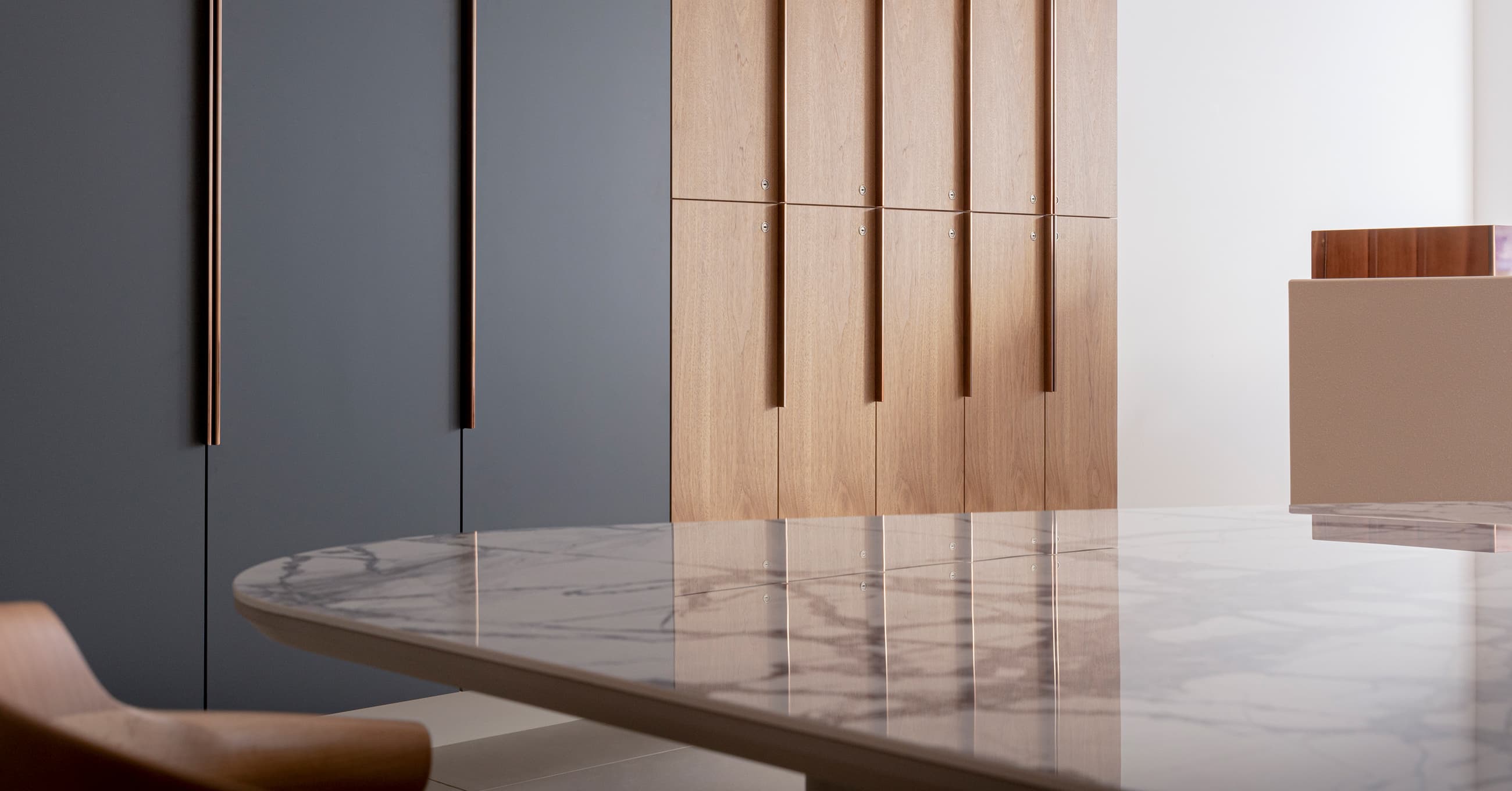
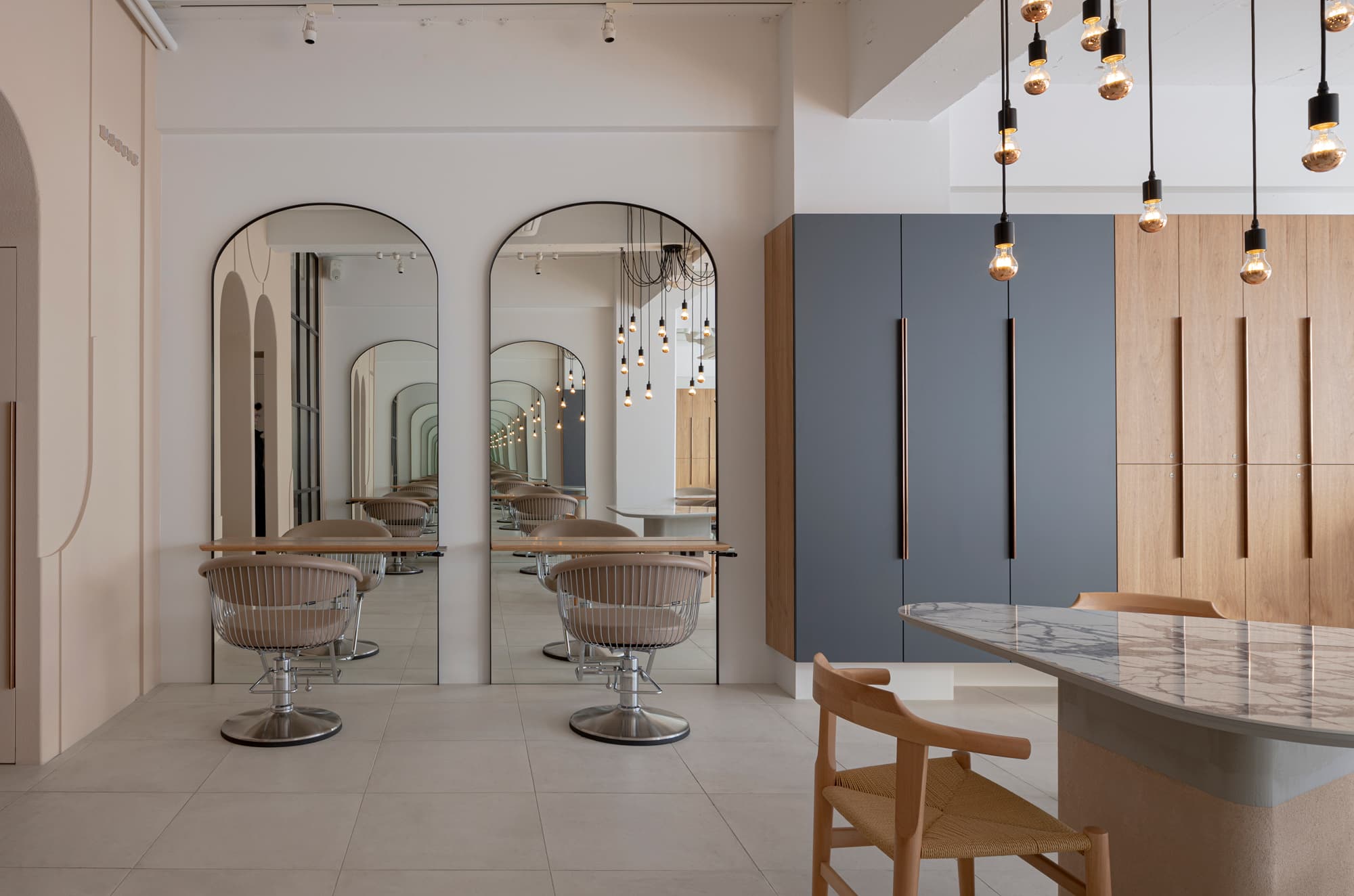
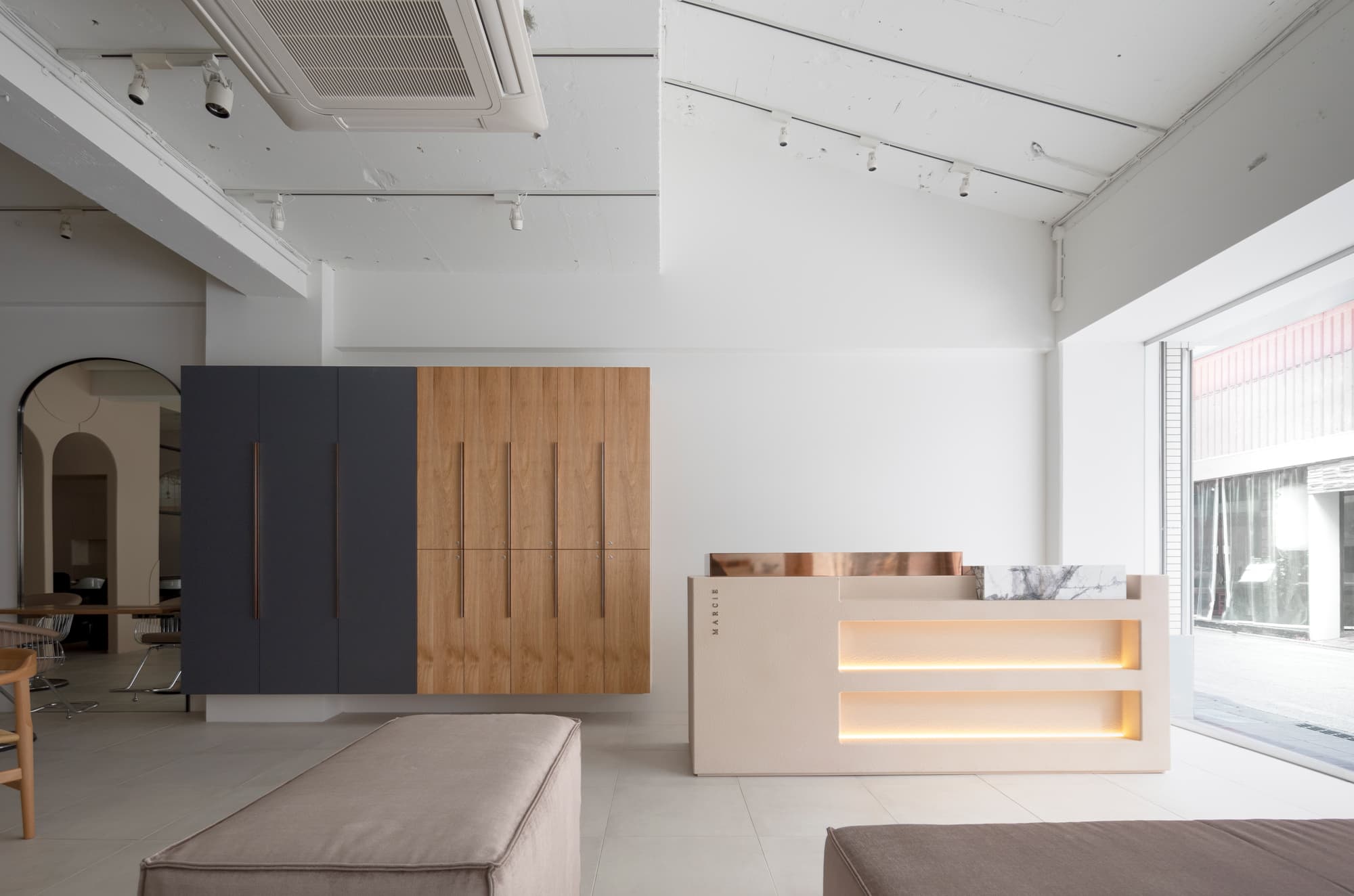
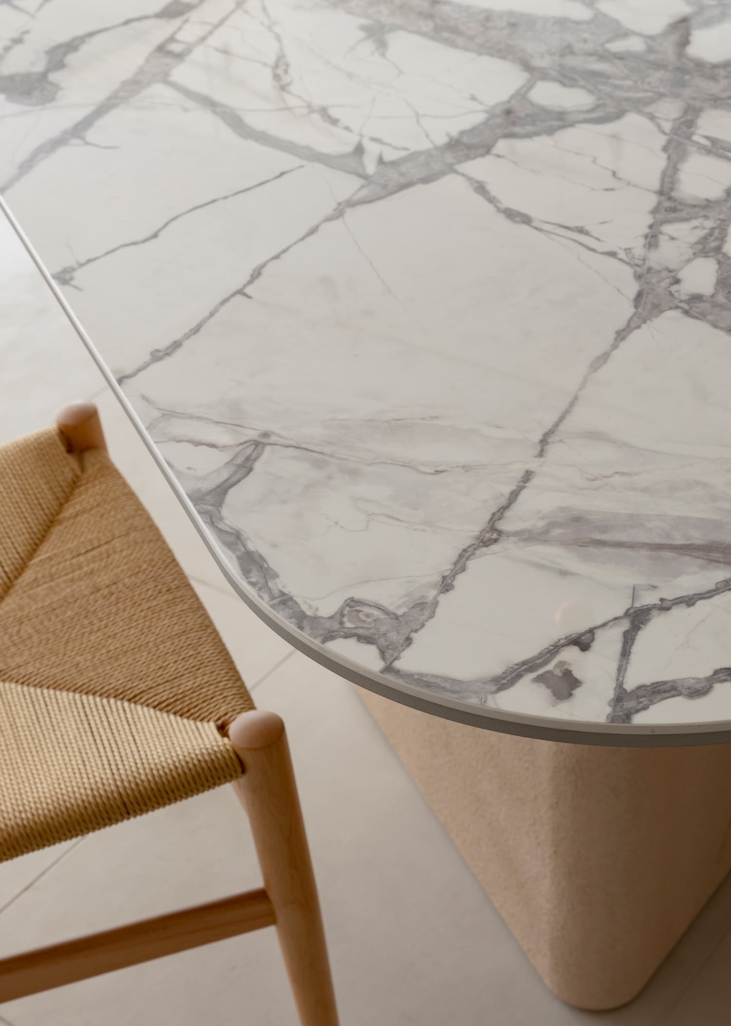
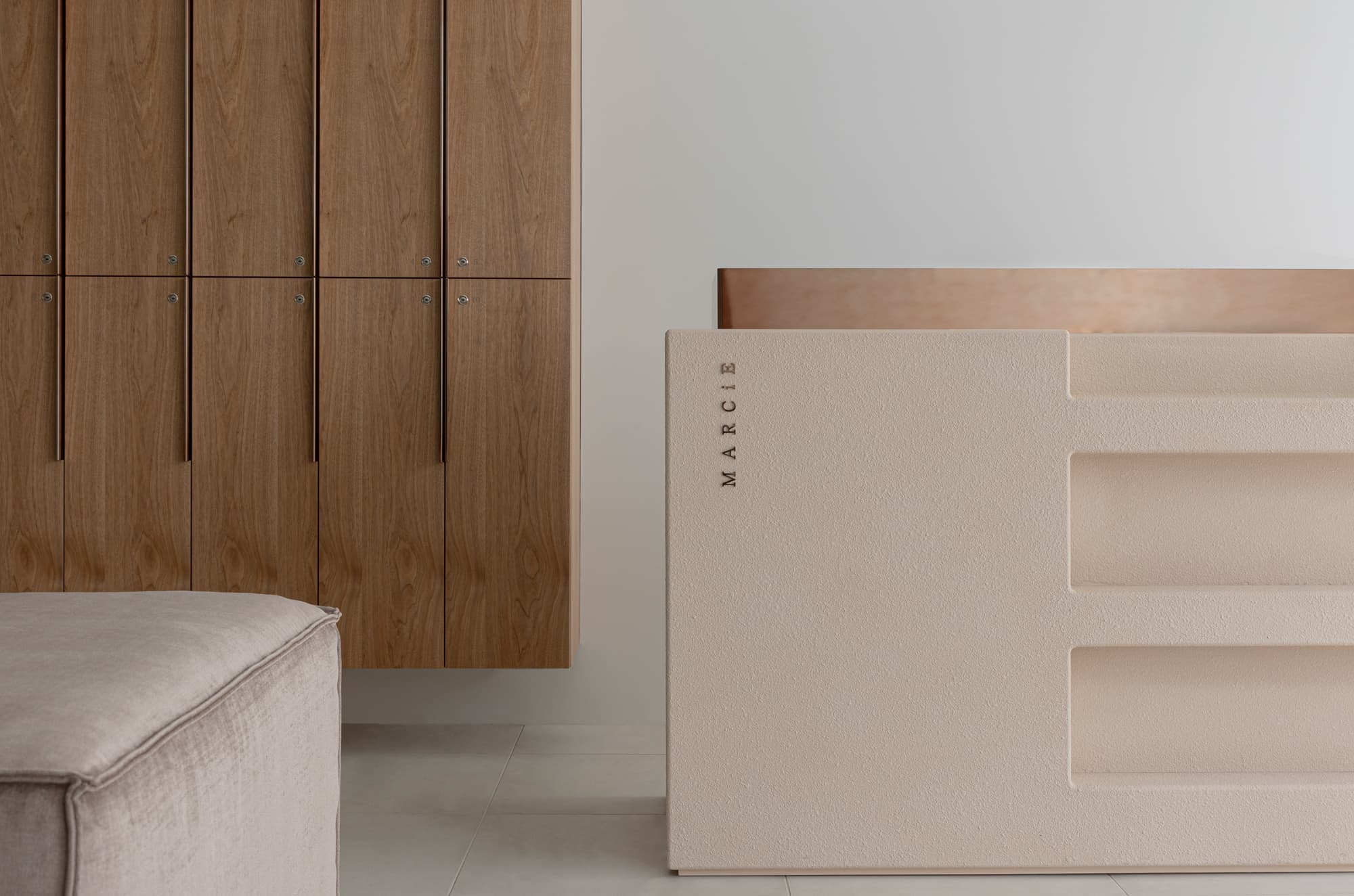
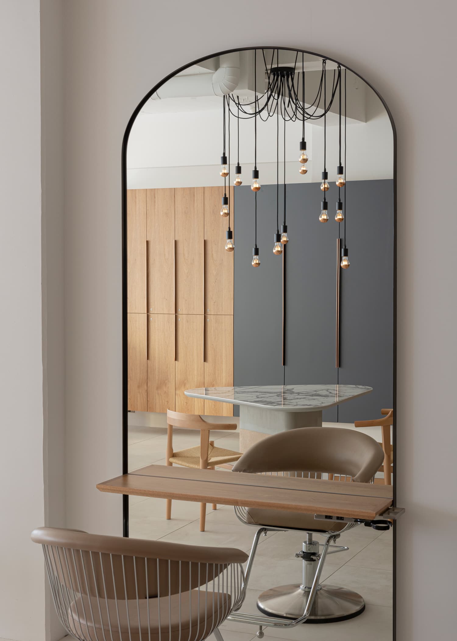
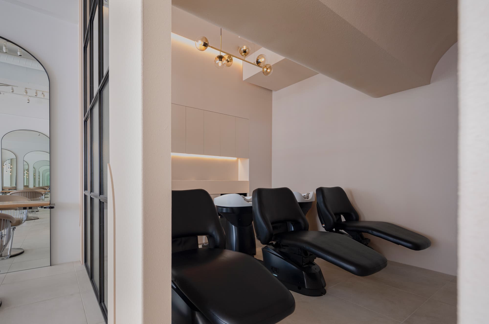
First, we mainly arranged various soft-colored elements as the basea foundation and added studded black and copper materials to create a contrasting space. While looking at detail viewpoints, they have their aestheticeach detail has its particular aesthetic appeal, we meticulously designed the shape and texture of the elements to create a harmonious spacebut to create a space where these elements come together in harmony we designed with great care in the shape and texture of the elements.
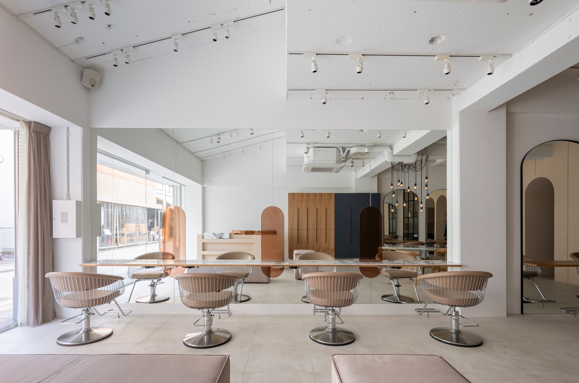
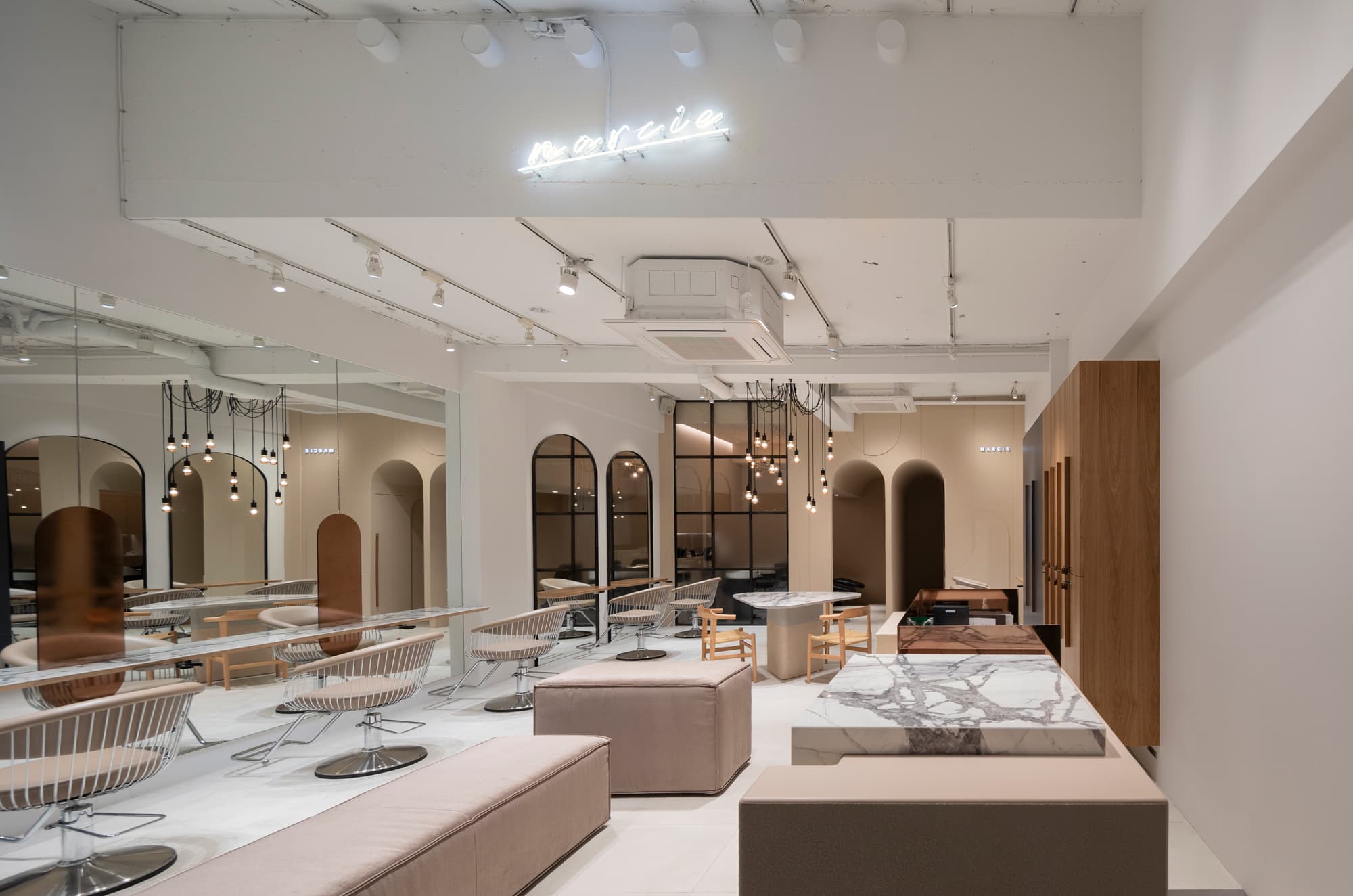
Many beauty salons in Japan typically have an efficient layout that allows customers to flow in one direction, divided into sections such as reception, hair consultant, and hair styling. However, we opted for an open design. By arranging the layout without dividing it into sections, we aimed to create an interior design that would make customers feel as if they were visiting a jewelry or clothing store.
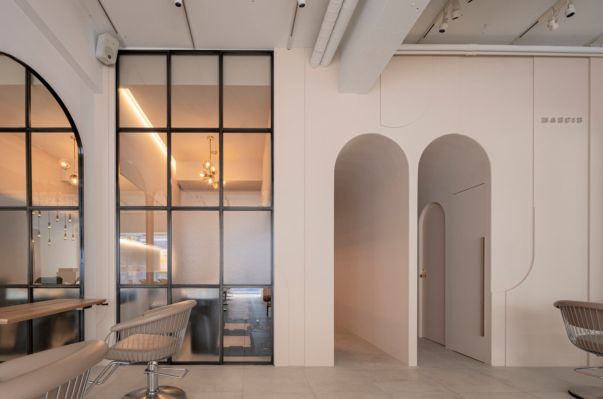
To make the entire floor appear larger, many we incorporated many mirrors are put on the walls to use the effect of the reflectionsto amplify reflection and created a height difference in the dynamic ceiling as much as possiblewith varying heights.
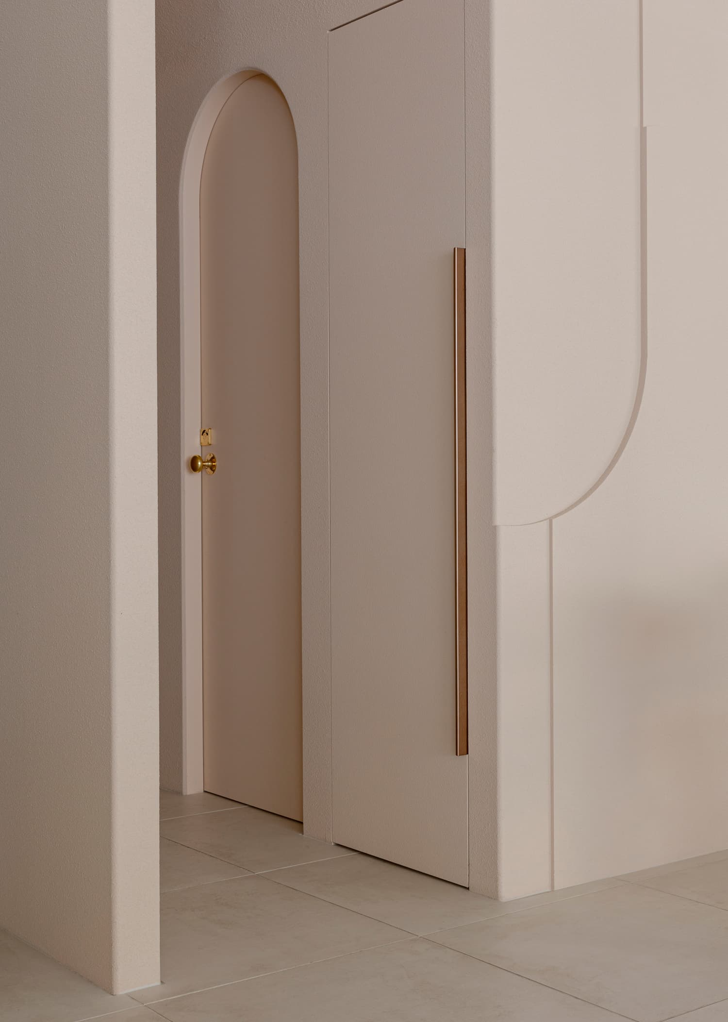
The arch shape on the iconic soft pink wall is made up of circular arcs in the sameequal proportions and features a textured plaster-like finish.
The same texture is used for the handles and custom light fixtures to create a cohesive elegantly cute look while keeping a sense of contrast.
In order to give visitors an impression of freedom and elegance, we aimed for a space design that defied the typical "beauty salon "look by avoiding the division of each section.

